
 WriterZen
If you’re working in the SEO or digital marketing space, you’ve likely heard the term "mobile-first indexing." This buzzword has been thrown around a lot lately, and for good reason.
Google is taking mobile seriously, and so should you!
In this blog, we’ll break down what mobile-first indexing is, how it affects SEO, and best practices to keep in mind.
What Is Mobile-First Indexing?
Mobile-first indexing is exactly what it sounds like. Google is now using the mobile version of a website as the primary index for ranking purposes, and mobile-first indexing represents that shift.
In the past, Google used the desktop version of a site as the primary index, even if most of their users were accessing the site from a mobile device. With mobile-first indexing, Google is recognizing that the majority of internet users are now on mobile devices and that the mobile version of a site should be given priority.
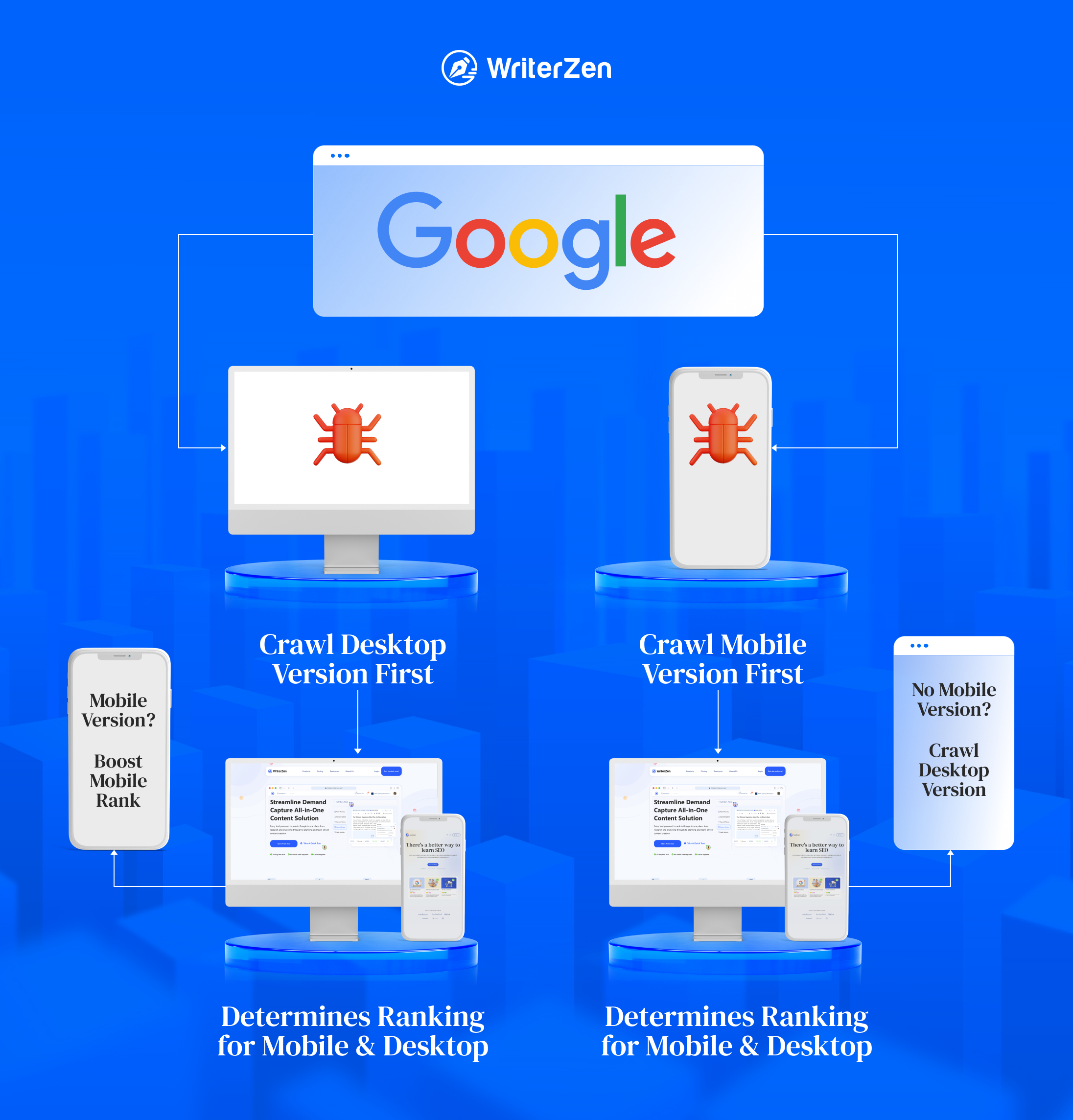
So, what happens is when a new website gets registered, Google's smartphone bot crawls it to look for mobile-friendly content. This information will subsequently be utilized to index and rank the pages.
Google's mobile-first indexing initiative seeks to give preference to sites that prioritize mobile experience. Thus, websites that provide a good mobile user experience will get rewarded with higher rankings in search engines.
Mobile Usability vs. Mobile-First Indexing
Mobile usability and mobile-first indexing are related but distinct concepts in the context of website design and search engine optimization (SEO).
Mobile usability refers to how well a website performs and functions on mobile devices. It includes factors like responsive design, easy-to-tap buttons, legible fonts, optimized images, and overall ease of use for mobile users.
On the other hand, mobile-first indexing is a shift in search engines' ranking and indexing methodology, where the mobile version of a website becomes the primary reference point for indexing and ranking. Search engines analyze the mobile version of a website to determine its relevance and visibility in search results, regardless of whether the user is searching on a mobile device or desktop.
In short, mobile usability is about creating a user-friendly and functional website for mobile users, while mobile-first indexing is about search engines prioritizing the mobile version of a website for indexing and ranking purposes. Both are important considerations to ensure a website's success in the mobile-centric digital landscape.
How Does Mobile-First Indexing Affect SEO?
Essentially, mobile-first indexing has made optimizing for mobile users' needs and preferences a requirement to maintain or improve SEO performance.
It's vital to note that Google still uses a single index for both desktop and mobile devices. However, the primary index for ranking purposes is now the mobile version of a site.
This means that if your desktop site is not mobile-friendly, you could see a drop in rankings on both desktop and mobile searches. Therefore, it's crucial to ensure that your website is optimized for both desktop and mobile devices.
If your website is mobile-friendly, you can rest assured that you're providing an excellent user experience to your visitors, regardless of the device they're using. This will not only improve your search engine rankings but also help you to retain and attract more visitors to your website.
After all, users’ comfort is what brands should keep at the forefront of their strategy.
Best Practices for Mobile-First Indexing
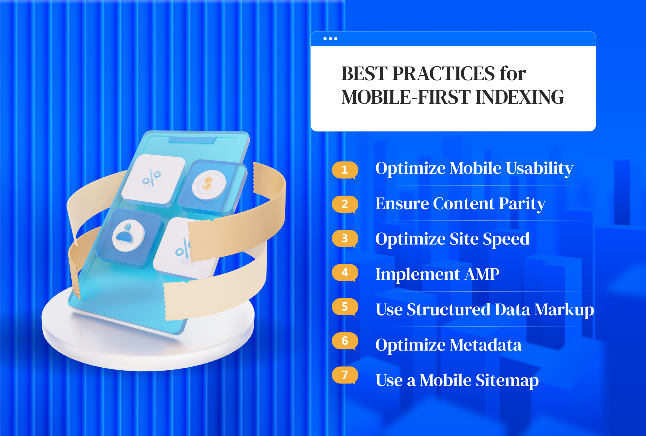
Optimize Mobile Usability
Your website needs to be mobile-friendly, meaning it should be easy to navigate and read on a mobile device. This includes having appropriately sized text, easy-to-click buttons, and a responsive design that adjusts to the user's screen size.
Ensure Content Parity
Content parity refers to the concept of ensuring that the same or equivalent content is available across different platforms or channels.
This means your mobile site should have the same content as your desktop site. You shouldn't hide content on the mobile version or serve different content to mobile users to avoid confusion, improve brand perception, and enhance customer satisfaction.
Optimize Site Speed
Speed is always important, but it’s even more critical on mobile devices. Slow-loading pages negatively impact user experience, making users grow impatient and leave your site for a faster one, in turn giving you a lower ranking.
Use tools such as Google's PageSpeed Insights to analyze your website's loading speed and identify ways to improve it. This could include optimizing images, reducing code, or using a content delivery network (CDN).
Implement AMP
AMP (Accelerated Mobile Pages) is an open-source initiative developed and supported by Google, with the goal of providing a faster and more optimized mobile browsing experience. It focuses on creating lightweight and simplified web pages that are specifically designed for mobile devices.
By implementing AMP, you provide a mobile-friendly version of your website that loads quickly and enhances the user experience on mobile devices. This aligns with mobile-first indexing principles and can positively impact your SEO efforts.
Use Structured Data Markup
Structured data markup helps search engines understand the content on your website and can improve your search engine rankings as your content will be displayed for those who really need it. Make sure to use structured data markup on both the desktop and mobile versions of your website.
Optimize Metadata
Metadata such as title tags and meta descriptions can affect how your website appears in search engine results. Make sure to optimize your metadata for both desktop and mobile versions of your website as well.
Use a Mobile Sitemap
A sitemap is a file that provides search engines with information about the structure and organization of a website's content. A mobile sitemap is a separate sitemap that provides search engines with information about the mobile version.
Use a mobile sitemap to ensure that search engines can crawl and index the mobile version of your website properly.
Final Thoughts
Mobile-first indexing is not a passing trend; it’s here to stay. It is a reminder of the importance of mobile optimization in SEO, and by prioritizing mobile optimization, you can ensure that your website is ready to rank highly on both desktop and mobile searches.
And, by following best practices such as ensuring your website is mobile-friendly, optimizing website speed, using structured data markup, and monitoring your website's performance, you can stay ahead of the curve and provide a great user experience to mobile visitors.


