Google has raised its emphasis on several ranking factors to make it easier for people to discover answers to their queries on search results. However, those factors change frequently.
Above the fold is one of those factors. Let’s read further to learn more about it.
Definition of Above the Fold
Above the fold is traditionally the upper half of a newspaper or a tabloid which features the important news of the day. It is the part that is visible first to the reader. However, it has brought dynamism to the world of SEO and has ever since been an essential factor.
The “fold” is the invisible line that divides the page content. You can see this content before you scroll down, and the content that follows is visible further as you scroll down.
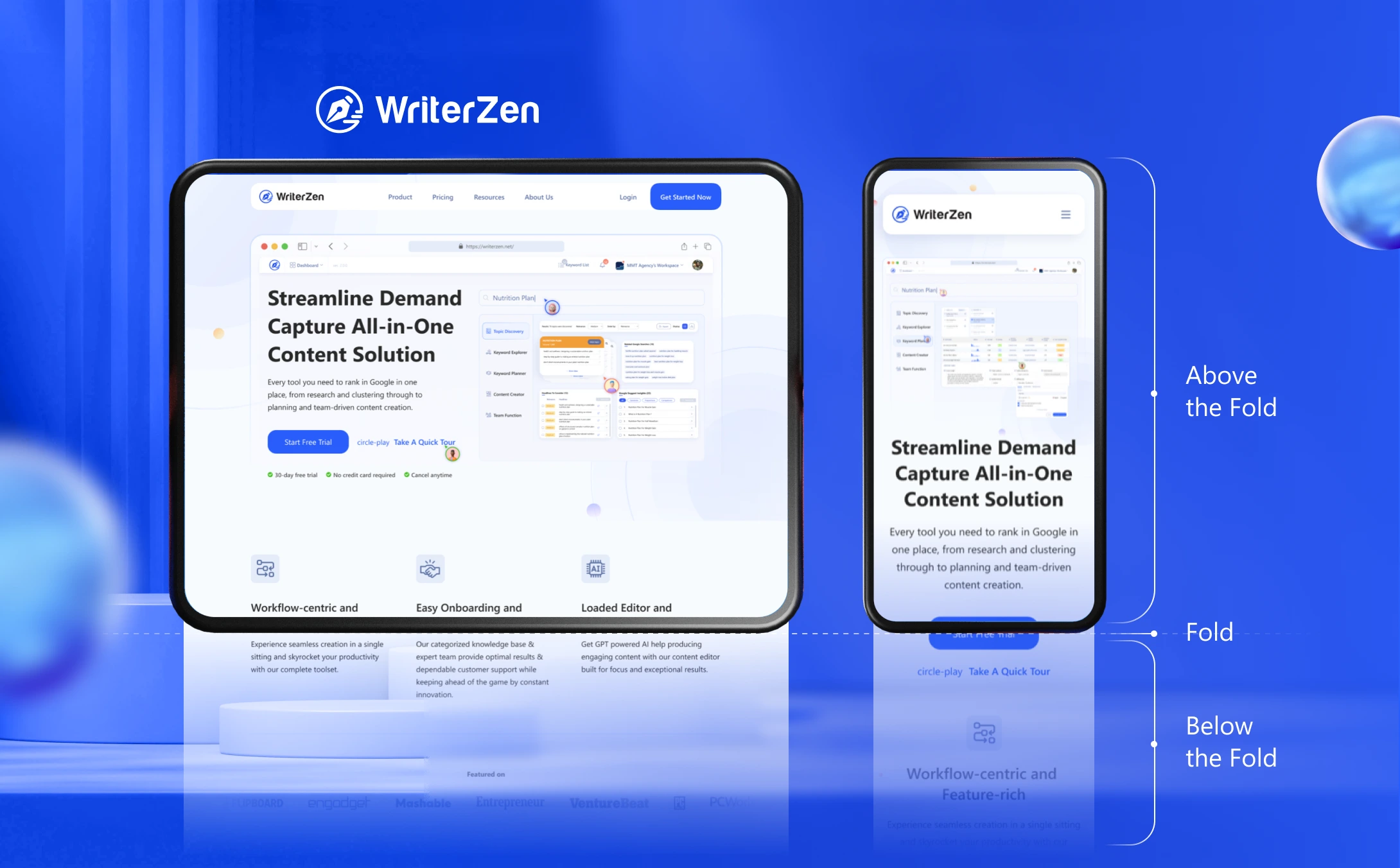
So, above the fold is how the users and your potential business clients observe your website and how the content on your website loads without scrolling. It is an essential part of website design and impacts your success in terms of SEO.
Is Above the Fold Still Relevant?
Yes, the "above the fold" principle is still relevant in web design and user experience.
It decides the audience’s first impression when visiting your website while giving you a chance for conversion with CTA placements. Ensuring that the most critical content and elements are visible without the need for excessive scrolling is also essential in creating a positive mobile user experience.
However, it's important to note that the concept of above the fold should be considered in conjunction with the overall user experience and content hierarchy of a website.
Users are willing to scroll if the content below the fold is engaging and valuable. Balancing above the fold area with relevant content throughout the entire page can lead to a more enjoyable and effective user experience.
What Content to Include Above the Fold?
Your webpage should include several items to attract users and get hooked to your website content. Thus, your selection of the correct elements widens your business’ scope.
-
Brand logo: Your brand logo is the key identification factor. Thus, to let your users know more about your business, the logo should be one of the first things they see.
-
Unique selling proposition (USP): USPs set your business or services apart from the rest of the crowd. A brief copy explaining your business and services gives the people a reason to stay on your website for longer and keep navigating to get what they are looking for.
-
Contact information: Provide your contact information to help your users get in touch with you. You can add your phone number, and email address above the fold for people to easily discover your business and get their queries answered.
-
Call to action (CTA): Adding a CTA to your above the fold is a great way to offer people a clear idea about the business and your services so that they can scroll down and find out more about it.
Best Practices for Above the Fold
Here are five best practices for optimizing the above the fold area on your website.
Clearly Convey Your Value Proposition
The content above the fold should immediately communicate the purpose of your website and the value it offers to visitors.
Use concise and compelling headlines, subheadings, and visuals that clearly articulate what your website is about and why users should stay and explore further.
Keep It Visually Appealing and Uncluttered
The above the fold area should have a clean and visually pleasing design. Avoid overcrowding the space with too much text or excess design elements.
Use high-quality images or videos, appropriately sized fonts, and ample white space to create a visually appealing and easy-to-read layout.
Showcase Key Calls-to-Action (CTAs)
Place important CTAs strategically above the fold to guide users toward desired actions.
Whether it's signing up for a newsletter, making a purchase, or starting a free trial, make sure your CTAs are prominent, visually distinct, and easily clickable.
Prioritize Responsive Design
Optimize the fold area for different screen sizes, particularly for mobile devices.
With the growing number of users accessing websites on smartphones and tablets, ensure that your content adapts and remains easily accessible and readable across different devices and resolutions.
Test and Iterate
Continuously test and experiment with different layouts, elements, and messaging above the fold to maximize engagement and conversions.
Use A/B testing and heatmapping tools to gather data and insights on user behavior, allowing you to refine your design and content for optimal performance.
Final Thoughts
Hopefully, this article has cleared up for you what above the fold means and it is still relevant. By following the best practices outlined above, you can effectively capture users' attention and drive them to explore your website further.
But remember, the above the fold area is just the starting point for engaging users. The content and design below the fold are equally important, so ensure a seamless and engaging experience throughout your entire webpage.


